

At the end of 2018, we made the decision that the previous rebrand had quickly become dated and didn’t truly reflect our personality and who we are as a company. It was then decided that it was time for a total rebrand and new website.
We decided to brighten the colour palette and modernise the colours to reduce the traditional feel in order to align with the new typography. Removing the gold from our colour palette was a key decision for us.
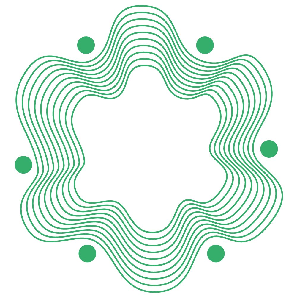
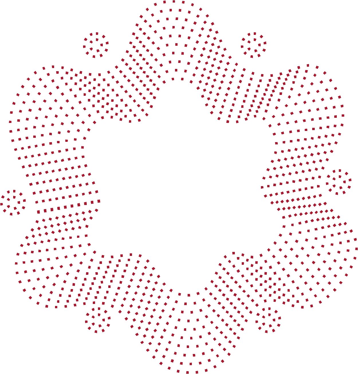
Although the logo has remained the same, we have redesigned the motif. With the motif being such a vital part of our identity, the redesign of this was essential to align with the brand makeover. The motif has evolved into a modern icon and can be displayed in any of the new Quanta colours.


.png?v=2b382faf381213a2977ed83a8c44488f)
.png?v=faacd9302a826ccc19c3f29df9e9f5e6)